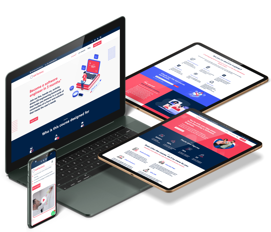
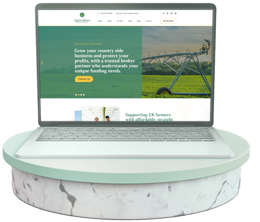
Connecting farmers and rural entrepreneurs to help them find a reliable and modified mortgage solutions
- Agriculture Mortgages
- UK
- Agriculture
- UI/UX Design
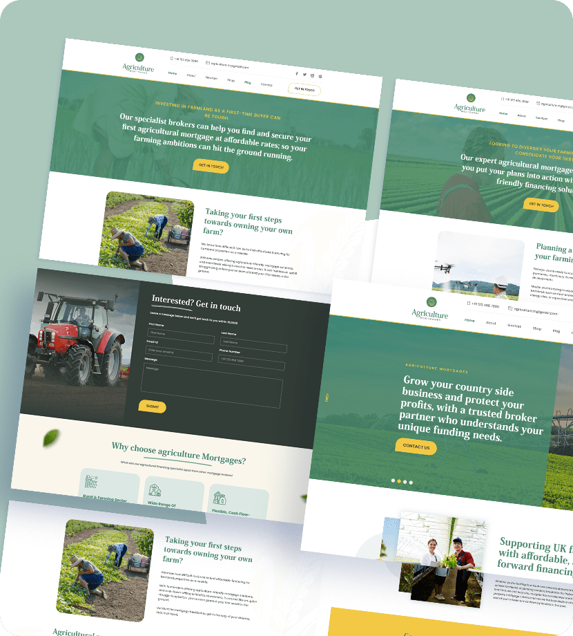
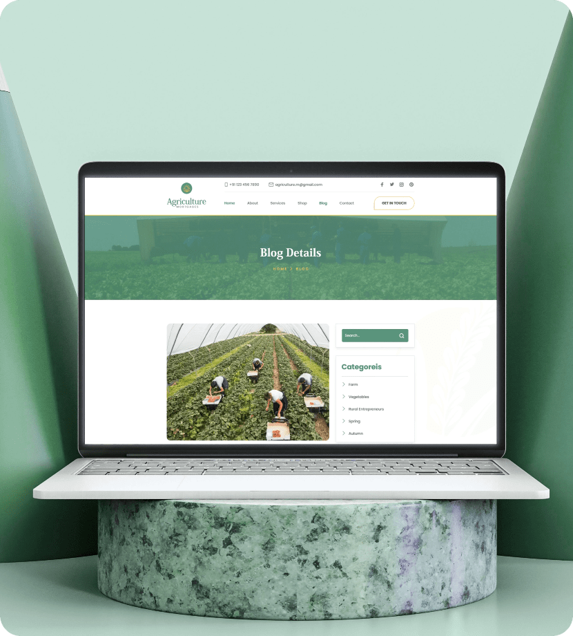
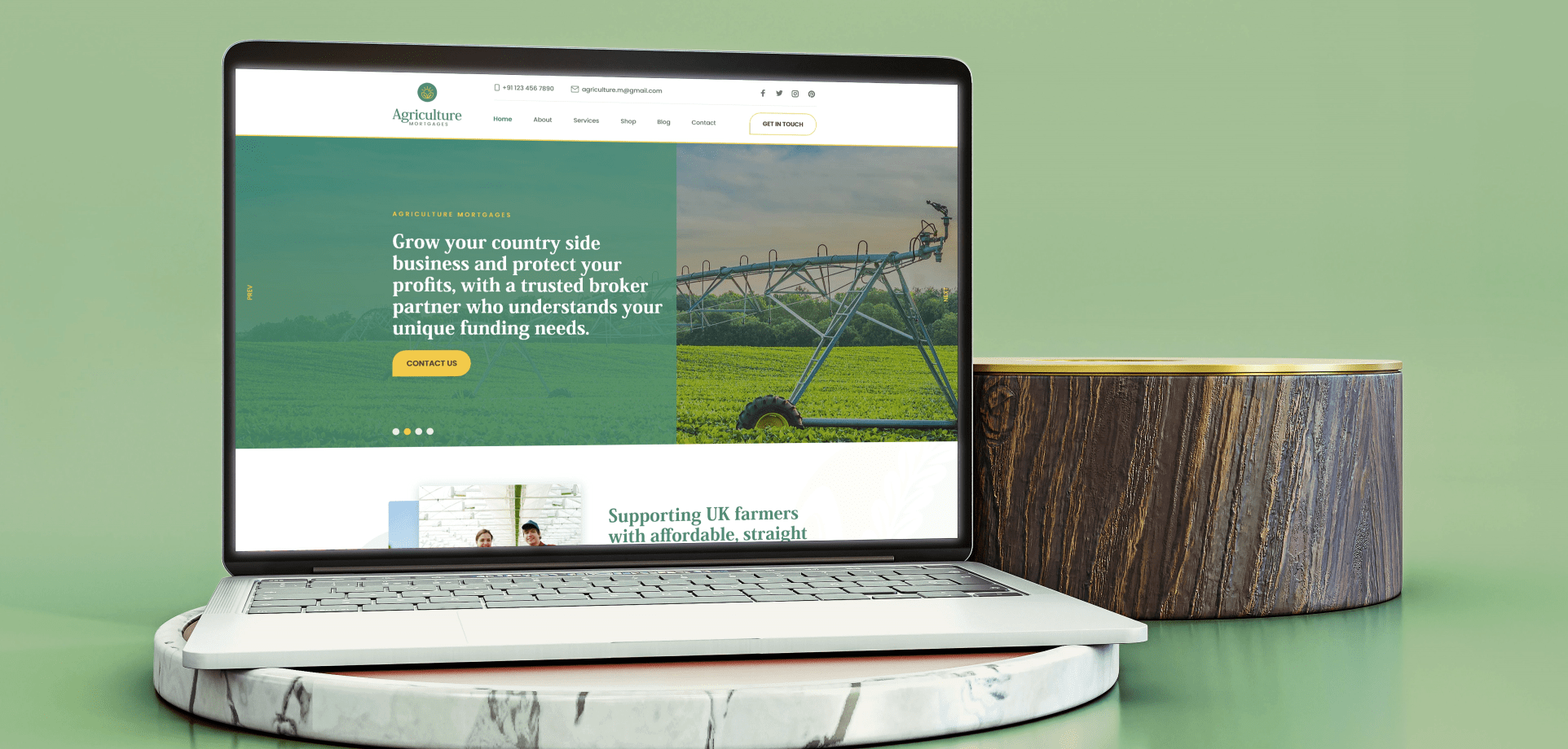
A cultivated and grounded design for an agricultural mortgage website
A cultivated and grounded design for an agricultural mortgage website
AGRICULTURE MORTGAGES
Agriculture
20+
2 Month
The major challenge for this provider was to provide the client with an user interface design that would help in generations of leads and attract more online traffic to the website. In addition, this being a mortgage website specializing in providing agricultural loans, the UI design had to reflect this for a more compelling user experience. So in order to meet the client’s project requirements, a responsive and easy to fill lead generation forms as a priority, with the integration of SEO tools within the framework of the website to increase and improve the online traffic. And the overall UI design had to imbibe the agricultural ambience of the business.
Discover - Our design work on the Agricultural Mortgages represents one of your finest works in terms of User Interface and User Experience till date. As the challenge we faced here was similar to the one we had when working for Aestheria, we did not try to reinvent the wheel and went for the same approach. We started off with identifying the elements of the website which were the main reasons why the site was not being able to attract traffic and hence poor generation of leads. The issues we found with the Agricultural Mortgage site was also similar to Aestheria, which was an interactive and responsive landing page for the website. Moreover, the site lacked the aesthetic appeal factor that makes for a captivating and emotional user experience.
Define - In light of our previous works, our team discussed ideas on what we could add more to the website not just in terms of better and more prolific lead generation but also in terms of a more compelling user experience. Use of colors and design to reflect and the brand would be one of the priorities. The overall UI design had to imbibe the agricultural ambience of the brand. Regarding better lead generations, the lead generation forms had to be responsive and easy to fill. An optimized chat window for prompt and engaging interaction with the users and an efficient integration of SEO tools.
Design - When doing the sketches we had to keep the brand and target audience in mind. The color palette and the images had reflected the product and the core value of the brand. The interface is responsive and engaging enough to attract the attention of the users long enough and persuasive enough that they would fill up the lead generation form. With these things in mind our team of designers started creating a low-fidelity wireframe for the website. Site being primarily the landing page for mortgage facilities, in the lead generation form we added fields for the mortgage amount the user would like to borrow, fields for suitable time to make contact and a message box for user or customer response. When building the prototype a highly responsive chat window was added and system designs for a more vivid and moving user experience.
Deliver - Before making the delivery of the final product, a validation of all the elements of the product was carried out. A final testing of the functionality of the lead generation forms, proper integration of the SEO tools, information architecture and performance analysis from user and business perspective was done. The final version of the product provided the client with a context-appropriate website both in feel and appeal, with a mobile responsive design and simple and aesthetically pleasing layout with a rich green quotient in terms of page styling and fonts.
The Adobe Originals program started in 1989 as an in-house type foundry at Adobe, brought together to create original typefaces of exemplary design quality, technical fidelity, and aesthetic longevity.
1234567890
ABVDEFGHIJKLMNOPQRSTUVWXYZ
abcdefghijklmnopqrstuvwxyz
1234567890
ABVDEFGHIJKLMNOPQRSTUVWXYZ
abcdefghijklmnopqrstuvwxyz
Geometric sans serif typefaces have been a popular design tool ever since these actors took to the world’s stage. Poppins is one of the new comers to this long tradition. With support for the Devanagari and Latin writing systems, it is an internationalist take on the genre.
1234567890
ABVDEFGHIJKLMNOPQRSTUVWXYZ
abcdefghijklmnopqrstuvwxyz
1234567890
ABVDEFGHIJKLMNOPQRSTUVWXYZ
abcdefghijklmnopqrstuvwxyz
Primary Colors
HEX
RGB
CMYK
#4A8B71
74, 139, 113
47%, 0%, 19%, 46%
Secondary Colors
HEX
RGB
CMYK
#F3C845
243, 200, 69
0%, 18%, 72%, 5%
Other Secondary Colors
HEX
RGB
CMYK
#D9E5E0
217, 229, 224
5%, 0%, 2%, 10%
HEX
RGB
CMYK
#1c4453
217, 229, 224
5%, 0%, 2%, 10%
HEX
RGB
CMYK
#6A726D
106, 114, 109
7%, 0%, 4%, 55%
HEX
RGB
CMYK
#303A4B
250, 246, 236
0%, 2%, 6%, 2%
Let's create a better user experience
together!